Introduction
Introducing Rating and Feedback Collector the most versatile Flutter package for adding highly customizable rating bars and in-app feedback dialogs to your app. Whether you need icon-based stars, emoji ratings, or custom images, this package handles it all with zero boilerplate.
Key Features
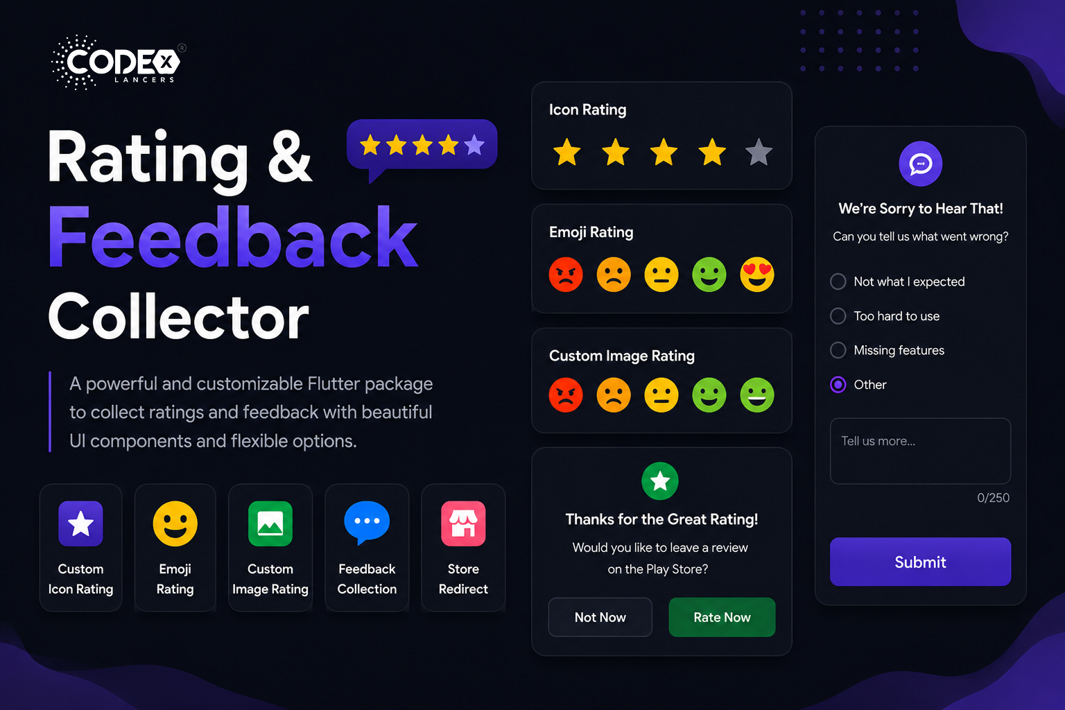
- Custom Icon Rating : Use any icon to represent rating units.
- Smiley Emojis Rating : Default emoji images to express ratings.
- Custom Image Rating : Use your own images for each rating level.
- Feedback Alert for Low Ratings : Prompt users to provide feedback if they rate low.
- Redirect to Store for High Ratings : Send happy users directly to the app store.
- Fully Customizable UI : Colors, fonts, border radius all adjustable.
- Submission Callback : Get feedback data with a callback function.
Installation
First, add the package to your pubspec.yaml:
dependencies:
  rating_and_feedback_collector: ^0.0.2
Then import the package in your Dart file:
import 'package:rating_and_feedback_collector/rating_and_feedback_collector.dart';Usage
Rating Bar with Icons
Use the RatingBar widget with fully customizable icons, colors, and optional half-ratings:
double _rating = 0.0;
RatingBar(
  iconSize: 40,
  allowHalfRating: true,
  filledIcon: Icons.star,
  halfFilledIcon: Icons.star_half,
  emptyIcon: Icons.star_border,
  filledColor: Colors.amber,
  emptyColor: Colors.grey,
  currentRating: _rating,
  onRatingChanged: (rating) {
    setState(() { _rating = rating; });
  },
),
Rating Bar with Emoji Images
double _rating = 0.0;
RatingBarEmoji(
  imageSize: 45,
  currentRating: _rating,
  onRatingChanged: (rating) {
    setState(() { _rating = rating; });
  },
),
Rating Bar with Custom Images
double _rating = 0.0;
RatingBarCustomImage(
  imageSize: 45,
  currentRating: _rating,
  activeImages: const [
    AssetImage('assets/Images/ic_angry.png'),
    AssetImage('assets/Images/ic_sad.png'),
    AssetImage('assets/Images/ic_neutral.png'),
    AssetImage('assets/Images/ic_happy.png'),
    AssetImage('assets/Images/ic_excellent.png'),
  ],
  deActiveImages: const [
    AssetImage('assets/Images/ic_angryDisable.png'),
    AssetImage('assets/Images/ic_sadDisable.png'),
    AssetImage('assets/Images/ic_neutralDisable.png'),
    AssetImage('assets/Images/ic_happyDisable.png'),
    AssetImage('assets/Images/ic_excellentDisable.png'),
  ],
  onRatingChanged: (rating) {
    setState(() { _rating = rating; });
  },
),
Customization Options
currentRating: Set initial rating value.filledIcon/halfFilledIcon/emptyIcon: Icons for each state (RatingBar only).filledColor/emptyColor: Colors for filled and empty units.allowHalfRating: Enable half-star ratings.showFeedbackForRatingsLessThan: Threshold below which feedback dialog appears.showRedirectToStoreForRatingsGreaterThan: Threshold above which user is redirected to store.androidPackageName/iosBundleId: App identifiers for store redirect.lowRatingFeedback: List of feedback strings shown in the dialog.showDescriptionInput: Show a text input in the feedback dialog.descriptionCharacterLimit: Limit characters in the description input.onSubmitTap: Callback triggered on feedback submission.isGoogleFont/fontFamilyName: Custom or Google font support.alertDialogBorderRadius/innerWidgetsBorderRadius: Border radius for dialog and inner elements.
Conclusion
The Rating and Feedback Collector package is the optimal solution for collecting user feedback inside Flutter apps. With flexible rating bars, smart feedback dialogs, and store redirect support, it helps you capture insights and boost your app’s store ratings all with minimal setup.
For full documentation, check it out on pub.dev.